CPA Australia
UX / UI Design & Front end development
Working with BA’s and or Tech Leads to discuss initial requirements, I’d then meet with internal stakeholders and external users to discuss project scope and best practices and get an understanding of the requirements in detail from their own perspective. I’d have them walk me through existing systems and explain what they needed and what their pain points were.
Workshops
Workshops were facilitated for certain critical sections of the system, not only did this provide a greater perspective of the complexities it was an excellent opportunity to get buy-in from a wider range of stakeholders from across the business.
Review, Ideation and UX Design
Starting the UX process by mapping out the customer journey I created flow maps defining options for internal and external users, what could be merged and what needed individual processes to achieve their goals.
After confirmation I’d progress basic sketches, Lo Fi Wireframe mockups (Hi Fi when necessary) and iteratively review with tech leads, BA’s and stakeholders. Designs would progress interactive prototypes that could be shared with the wider team and stakeholders.
Usability Testing and Reviews
Stakeholders, staff and members both familiar and unfamiliar with the applications were gathered to test designs and experiences. Asking them to achieve specific goals, navigate and talk us through their own experiences, I would document this and review outcomes with stakeholders before making final amendments.
HTML Prototyping
After concepts were confirmed I would create working prototypes developed in HTML, CSS/3, jQuery and handed over to developers to integrate into the application.
Outcome
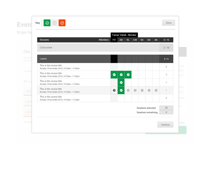
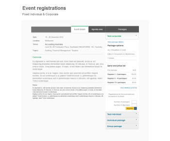
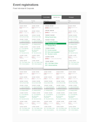
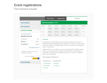
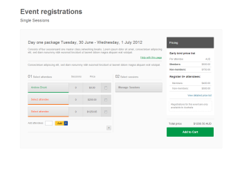
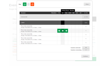
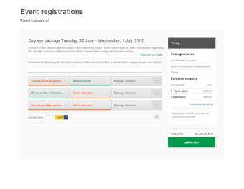
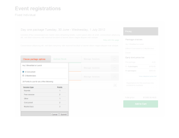
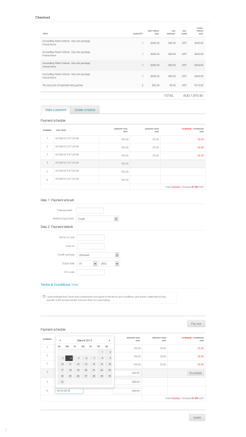
The previous experience required up to 7 pages for a single registration, my solution allowed multiple registrations from a single dashboard then opening a single modal window to manage one or multiple session registrations with a single checkout.
The project presented unique challenges that required new / innovative UX I haven’t experienced elsewhere. The overall solution achieved a 70% reduction of customer booking related service calls, positive feedback from across the organisation and members booking events and training.
