Banking app money-transfer UX case study
Reducing friction in new-payee money transfers for one of Australia's leading banks.
The Challenge
As part of leading Australian bank team, I ran a focused design sprint. My brief was to provide evidence‑based UX recommendations to optimise the mobile money‑transfer experience for new payees. The banking app was already performing well overall, but internal usability testing and analytics exposed several issues in the “add new payee” and transfer flow:
- Only 61% of new-payee transfers were completed in under 60 seconds (vs. 89% for repeat payees).
- Only 52% rated the new-payee experience "very smooth" (vs. 89% for repeat transfers)
- Disruptive full-screen 2FA modal that broke flow after contact entry
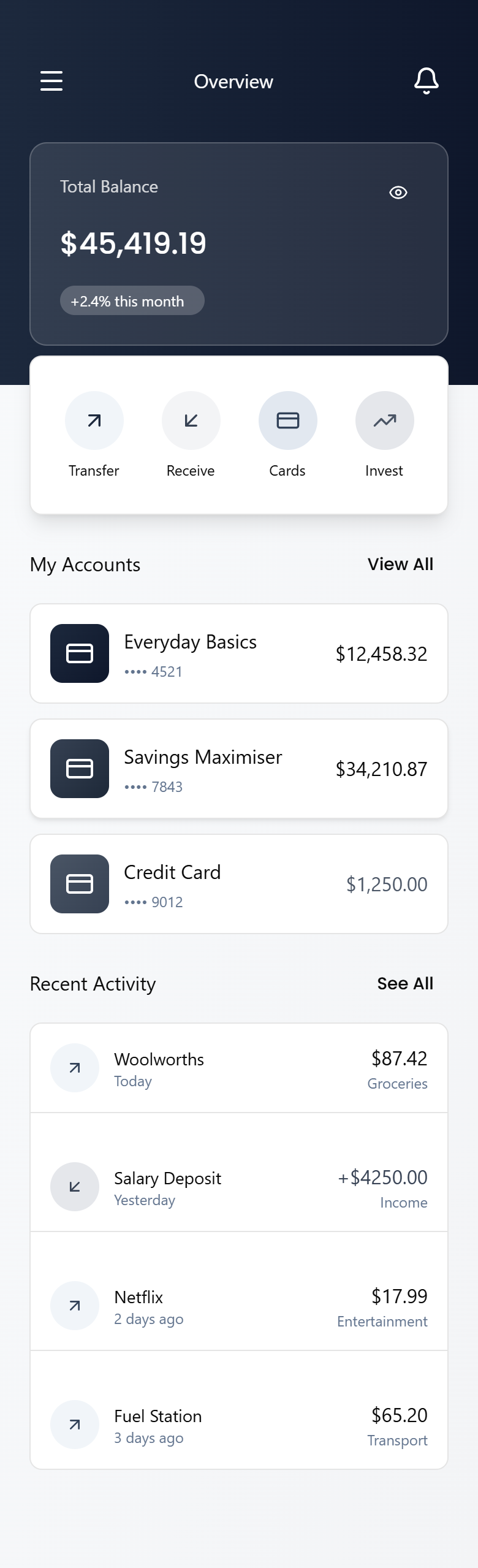
- Transaction history buried behind navigation, forcing users to leave the transfer screen to double-check past payments
The bank already had a substantial research library including: heatmaps, session recordings, 200+ usability‑test clips, and quantitative funnel data. The research allowed me to treat this as a focused banking app UX case study: spending my time designing and validating targeted fixes rather than re‑running foundational research.
Business Goals
- Raise new-contact transfer completion by 20%–30%
- Reduce time-to-complete transactions by 10–20%
- Cut related support tickets for money transfers by >15%
- Keep perceived security and trust scores unchanged
What Was Done
Discovery & Synthesis
- I deep‑dived into the bank’s existing research library and Amplitude funnel data to understand today’s money‑transfer journeys.
- I mapped the top three friction points in the new‑payee flow and prioritised them with the product and analytics teams.
Design & Prototyping
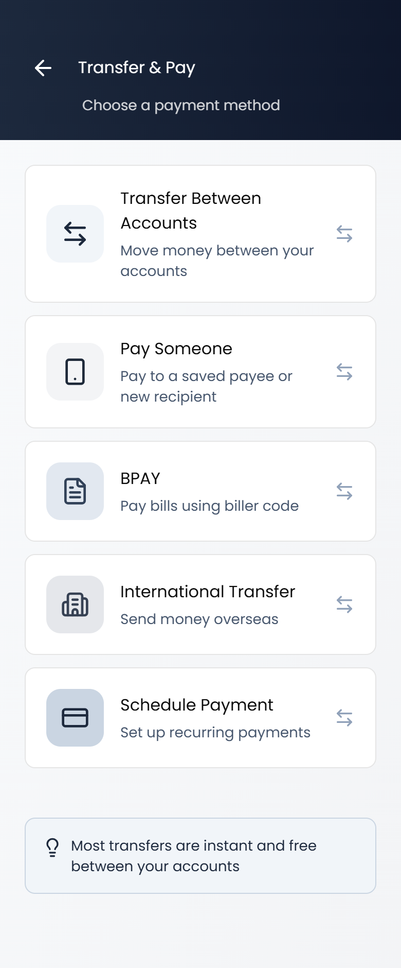
- I redesigned contact addition and verification into a single progressive screen, keeping users in one focused flow.
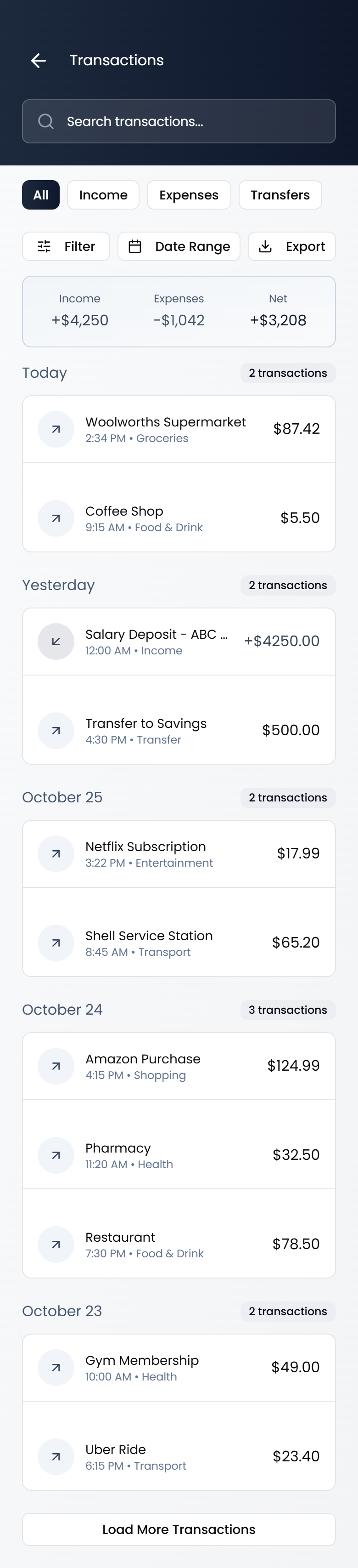
- I embedded predictive transaction search and “recent activity with this contact” directly in the transfer preview so customers no longer had to jump out to history.
- I delivered a pixel‑perfect, clickable Figma prototype that mirrored the bank’s design system and was ready for usability testing.
Final Deliverables
- High‑fidelity prototype of the optimised banking app transfer flow, ready for moderated and remote user testing.
- Annotated user-flow documentation linking every UX decision back to the bank’s original research and metrics.
- A before / after comparison deck the product team used to secure stakeholder sign‑off on the new design.
Design Process
Follow my design process from early wireframes through to high-fidelity greyscale screens for the new-payee money-transfer flow.
Results
Key Learnings
This project reinforced for me that even small interruptions in an otherwise strong banking experience can create measurable friction. By using high‑quality research, I was able to move quickly and still deliver precise, low‑risk UX improvements. For future banking UX engagements of this type, I now invest even more time up front co‑creating the success‑metric dashboard with analytics teams so we can measure the impact of design decisions on money‑transfer journeys with confidence.